America’s Cup 2017 @Bermuda: Drafting AC50 Foils
Update: Feedback from a reader says mainfoil horizontal should point downwards, well that depends on the tilt given and the outer vertical curve commented I need to refine, but additional render with more tilt shows that (check daggerboard at deck exit to compare tilt).
—
Some readers were asking for foils details, working on it thus not much updates latest hours. I’m trying to draw & catalog AC50 foils. Good shots are available only now as the teams have no option to photoshop or hide them once racing, no use to neither at this time.
Trying here to go more than simple concept lines and aim to the actual shape. Also managed to have an aprox of one main foil section, which is pretty radical , I assign this shape to structural / strength limitations along design intent.
That section from one of the teams, is featured in draft render foils above. All teams have a similar gral concept but of course details make speed &perf diff along plan & overall board shape.
Above starboard AC50 hull with Oracle light wind foil, still much draft and need to refine planshape, outer vertical curve etc, overall dimensions are aprox ok and rule compliant on the 4.200m box. Port hull featuring Oracle high winds smaller & sharp dihedral mainfoil.
Winglets are New Zealand style; Note bulb is gone, they have split winglets area. Other teams have the same feature like Artemis, with a more radical shape and vertical tips. France & BAR from the ones I have are flatter and more standard. Think OR ones left to depict.
Will place Artemis & TNZ mainfoils later to compare, this just a quick teaser as I need to keep drawing plus the AC Final is coming.
Either way a fun process to learn what top notch designers have done for this Cup Edition.


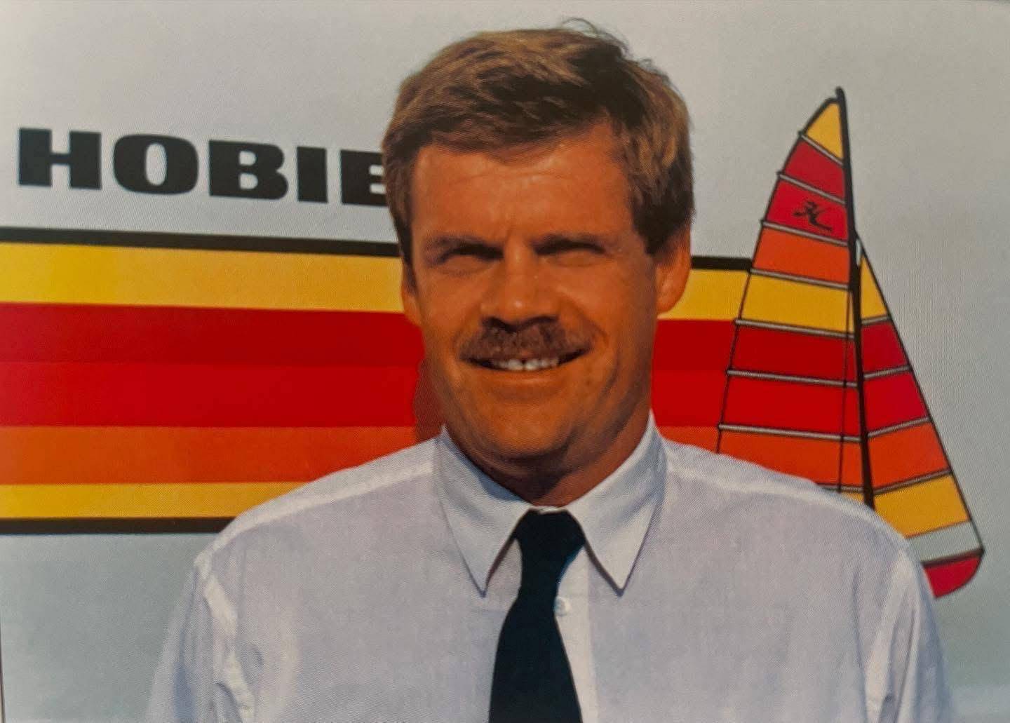




I just heard that my great sailing friend and former CEO of Hobiecat Europe has passed. May The endless oceans…
...Report was sent by an F18 Sailor, if you want Hobies reported send your own, we'll publish as usual. Cheers.
Looks like in your report the Hobies are not really present. Suggest to rewrite the article.
Thanks for the great report Wik. Great battle.
If I correctly read the results the overall winner this year is a Hobie16